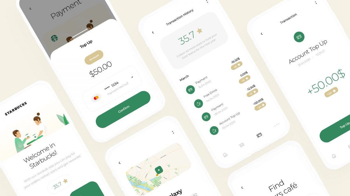
As coffee lovers, here at INVO, we decided to reimagine one of our favourite apps. Since we can’t really use it in quarantine, it’s nice to at least look at it. In all seriousness, reward programs are one of the best ways to gain loyalty among your users. So they should have the best possible experience. We took the existing mobile app, broke it apart and put it back together to create a new, state-of-the-art mobile app that would make you collect those Starbucks stars!
Our Process
For each of our projects, even the concept ones, we follow certain guidelines and processes. Because creating concept projects is not just for fun. It helps us discover new markets, industries and learn about different target groups. So, each time we start with research, create wireframes, design the interface, make a prototype and then test it on a few target users.

Market Research
To gain insight into what could be improved, changed or added, we conducted simple market research. Here are the most important pieces of information our team gathered:
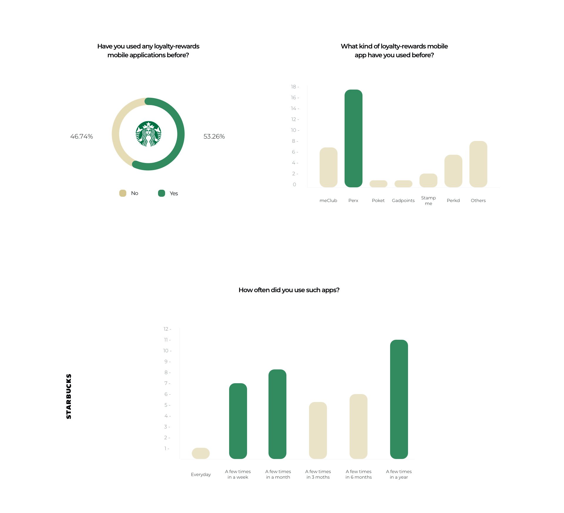
The results have proven our theory that people are not fond of loyalty apps and programs and that their engagement is very low. Considering the users’ reviews of the Starbucks app and our research, we moved on to designing the functionalities.
Functionalities Map
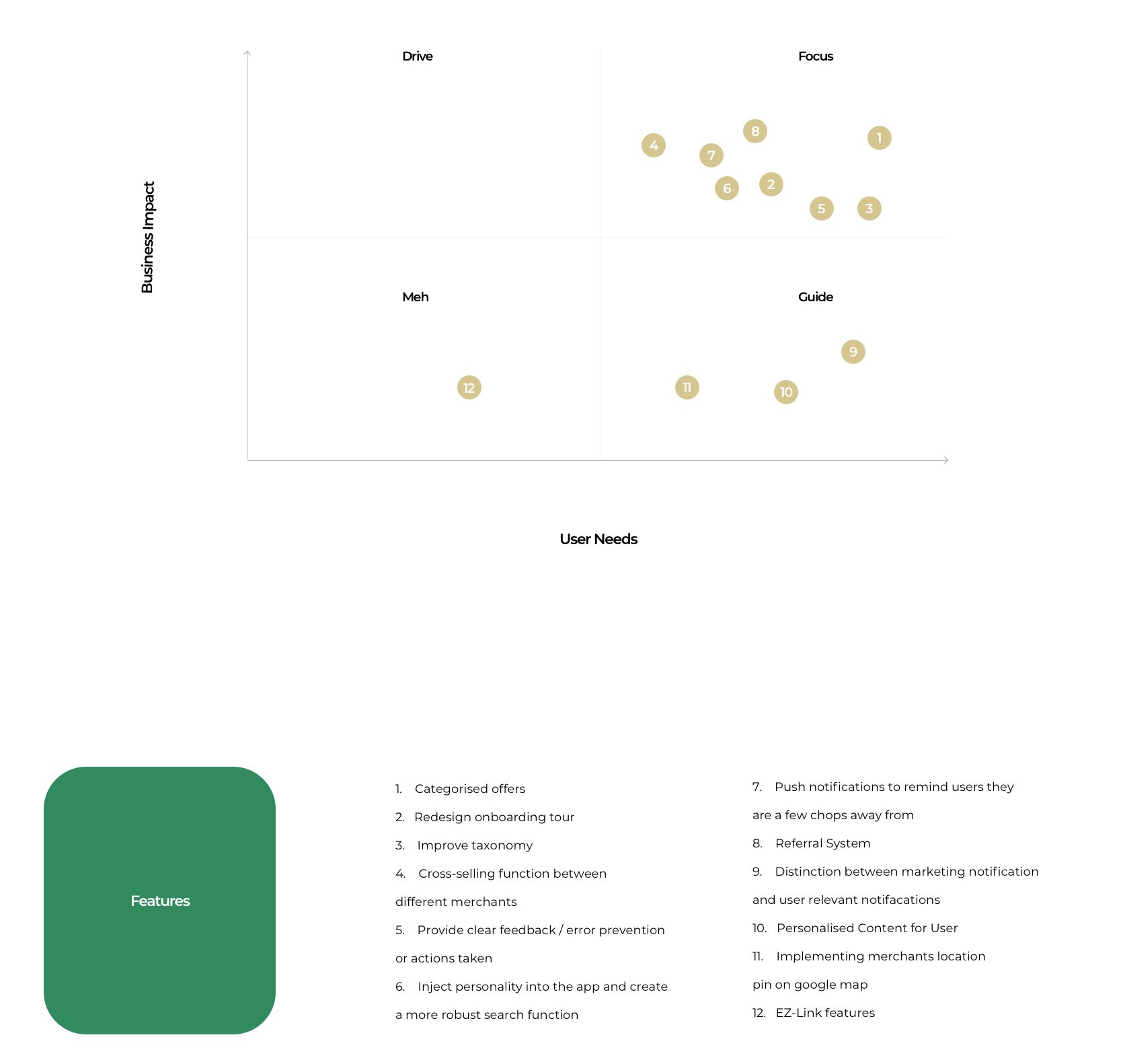
To understand the role this app plays both for the customers and the business, we decided to map out all the possible functionalities and put them on a map. There are four different categories the functionalities fall into as well as two axes. Based on our research, we were able to spread them out and decide which are crucial for both the business and the users, and which ones can be added later.
User Flow
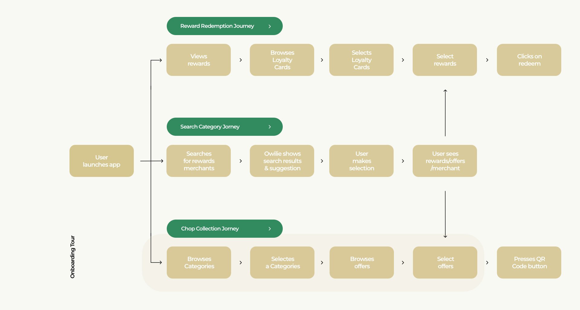
Below, you will find a fresh User Flow for the Starbucks Rewards Mobile App. We focused on simplifying the user journey and making the experience quicker and smoother.
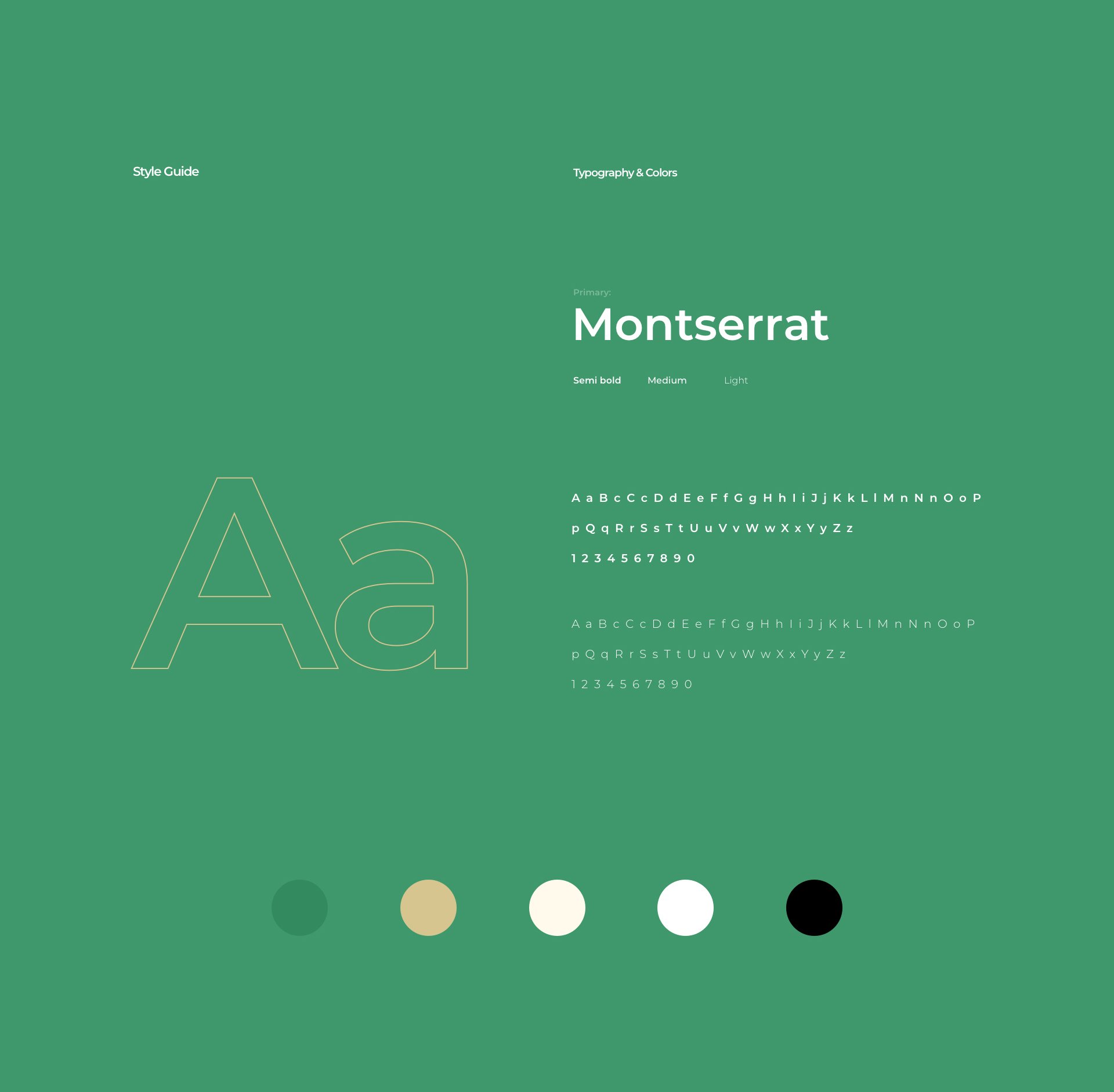
Style Guide
For each project we create a style guide. This makes future work easier and makes the work quicker for the development team. We believe that a style guide is extremely important, so here it is:
The Redesigned App
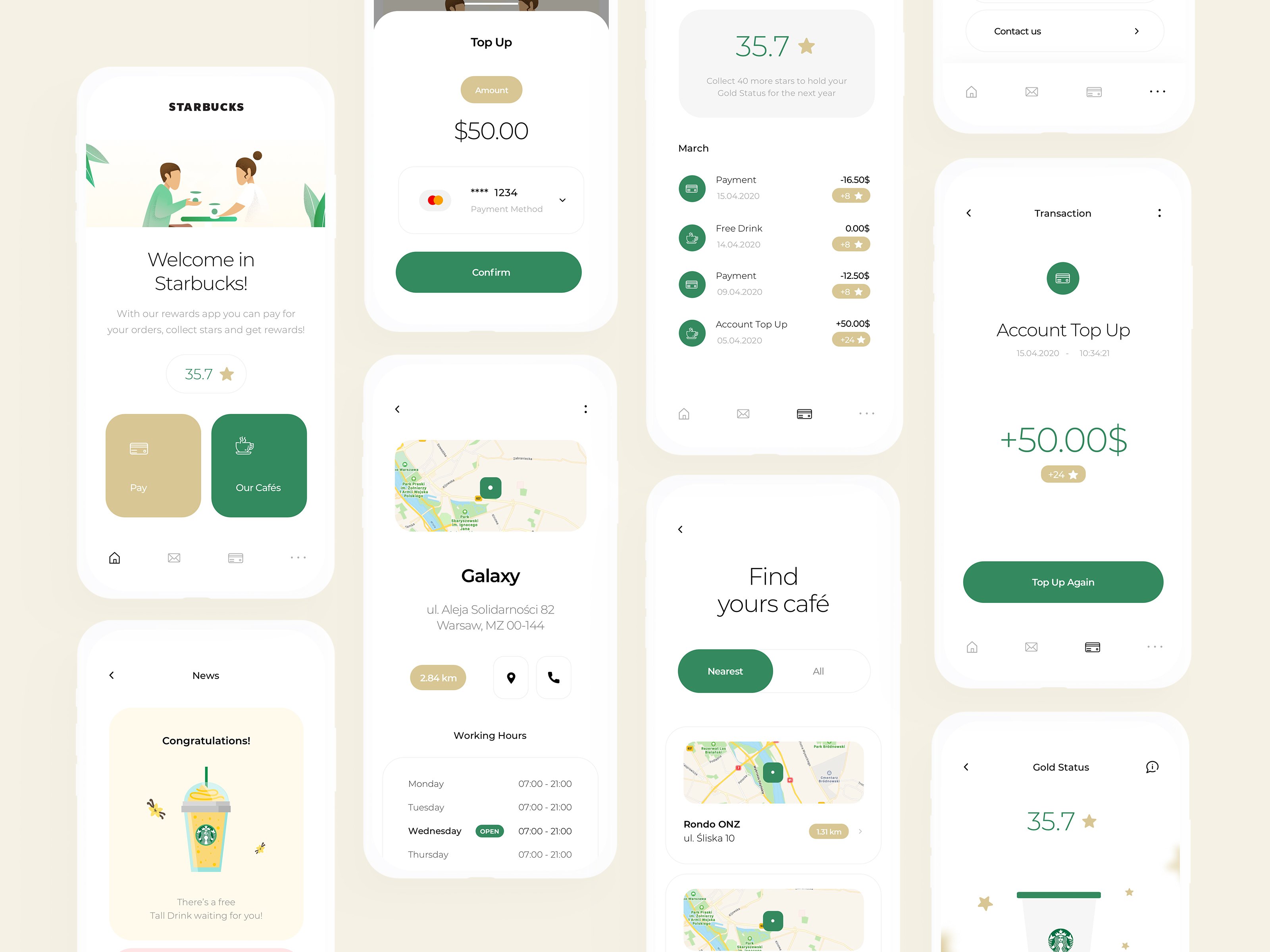
Without further ado, here’s a few of the screens from our reimagined Starbucks Rewards Mobile App. If you’re interested in a specific screen-by-screen breakdown you can visit our Behance profile.
Homepage
The redesigned homepage focuses on clear navigation. It features a new bottom menu to declutter the amount of buttons and CTAs. It provides all the necessary actions in the reach of a users thumb – finding a coffee house, payments and reward status. All this makes for a better user experience.
Transaction Management
There’s nothing more exciting than seeing your points or stars go up and get you that free product or service. Our redesigned app features transaction tracking and management so that users can easily see their spendings and check on their reward status at all times.
Café Finder
It’s one of the more underestimated functionalities in the current Starbucks app. We wanted to give it a fresh look so that more users would find it useful. Based on user’s current location, the app finds the nearest Starbucks, shows all the details and helps the user navigate.
Payments
The Starbucks App involves transferring money to your loyalty card and then paying with it for your orders. We needed to make it as simple and quick as possible so as not to lose users on the most important part of the journey (business-wise). That’s why the payments have been designed to be straightforward and transparent.
If you are interested in learning more about this project, you can visit our Behance profile for a case study or our Dribbble to see single shots and app screens. Our team is also available for other projects, you can contact us at [email protected].
