
Why do we find certain designs better, more appealing? The answer lies in math. The golden ratio is something we frequently find in nature and many over the years used it in their designs. What is it exactly, why do we find it visually pleasing and how using the golden ratio in web design can make your designs better?
What is Golden Ratio?
You might have heard about golden ratio under many names – the divine proportion, the golden mean. Simply put, the ratio is actually a number. A golden number. We use the Greek letter φ to represent its value of 1.61… and so on. You don’t need to know the exact number to use it successfully in your web designs. But the thing you should be familiar with is the golden rectangle – a figure constructed using the golden ratio.
The Golden Rectangle in Web Design
As you can see in the picture below, the golden rectangle is made in such a way that the proportions of its sides will equal the golden number.

Now that you know what is the golden ratio and what is a golden rectangle you are probably wondering how does it all link to web design? Designers certainly don’t sit with calculators all day and work accordingly to the divine ratio exactly. But the proportion can be useful to them, especially when it comes to the website layout.
Website layout using the Golden Ratio
Using the golden ratio in web design is mostly using the golden rectangle to determine how to place elements on the website. For example, let’s say that the width of the website you’re working on is 1000px. You need to fit the side column and the main content column into said width. You could, of course, do it more or less without any thought put into it. But it might be a good idea to use the golden ratio to make the design more visually appealing to whoever sees the website.
How to do that? It’s actually really simple. You just take the 1000px, divide that by 1,61 or so and round the result – in this case, you can round 621,11 down to 620. That is the width of the main content column. And the width of the side column is what’s left. It may seem unnecessary but it does make a great difference in how the visitors perceive your website.
Golden Ratio in Web Design Using Grids
Besides the basic layout, websites consist of many elements. How to place them in an aesthetically pleasing way? This one can be also done more or less, just like the layout, but many designers use grids to place elements on the web page. It makes the placing more organized and appealing to the eye. There are two most frequently used grids – the Phi grid and grid based on the rule of thirds.
The Phi Grid
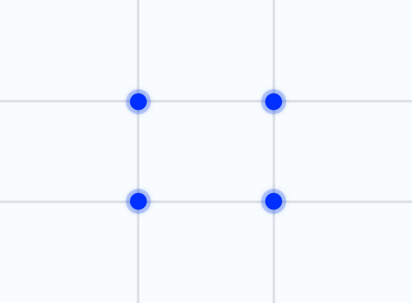
The Phi grid is named after the previously mentioned Greek letter which represents the golden proportion. That’s because the grid is made accordingly to the golden ratio. Take a look at the grid below.

The rectangles which make the grid are the golden rectangles. You are probably wondering what are the blue dots seen on the grid. These are the places where the human eye is naturally drawn to while looking at the picture or website. You might want to keep that in mind while placing elements on the website. If you want something to be noticed – that’s where it should be placed. Whether it is a button or a picture.
The Phi grid can also be used to crop images for your website. Just as with placing elements on the web page, you simply make sure that the most important part of the picture is at least somewhere near the focus points (marked as blue dots above). This way you can ensure the image will be pleasing to the viewer.
Although useful, using the Phi grid can be slightly inconvenient, because every website has different measurements and you would need to calculate the grid every time. That’s why the simplified version exists.
The Rule of Thirds
Let me introduce you to the rule of thirds. It’s a simplified version of the Phi grid to help you use the golden ratio in web design without having to calculate the grid every single time you want to design something. Let’s take a look at the grid based on the rule.
The principle behind the grid is that it divides the space into nine equal parts. The grid is actually frequently used in photography (you can enable it on your camera or phone) but there is some scientific data behind it, that can be useful for a web designer.
Like with the previous golden-ratio-based grid the image above has the focus points marked on it with blue dots. The thing is – they are said to be bigger than the ones on the previously shown golden grid. What is more, after studying how peoples’ eyes scan websites, it has been discovered that the top left line-crossing point is the one grabbing the most attention. Over 40% of the web page’s visitors focus on this point first, for the longest amount of time.
Similarly to the Phi grid, the grid based on the rule of thirds can be used to place elements on your website in a way that creates visual harmony. So basically, the grid helps with one of the most important things when it comes to web design.
The Science Behind the Golden Ratio in Web Design: Why Does It Work?
As you might know, the golden ratio dates back to Ancient Greece. Because the proportion is commonly found in nature, Greeks believed it had a special influence on human’s perception. And they were not wrong.
The designs made using the golden ratio, or anything based on it, are something we subconsciously find beautiful. Close to perfection or even actually perfect. For this exact reason artists like Leonardo da Vinci or Salvador Dalí have based their artworks on golden ratio. And we perceive their work as masterpieces to this day.
The golden ratio is “working” because it satisfies our natural need for symmetry. We simply find symmetrical things more appealing. Studies have shown it also applies to how we perceive other people – the more symmetrical their face is, the more we find them attractive. That’s why the golden ratio is crucial for web design and designers should keep it in mind while creating web pages.
Use Cases of the Golden Ratio in Web Design
Besides the layout, the golden ratio can also be used in branding – designing a logo for example. It doesn’t mean the logo has to be an actual golden rectangle or so, but it can incorporate some “golden” elements or be based on a special spiral – the golden spiral.
The golden spiral is, of course, based on the golden ratio. It’s a geometrical spiral which’s growth factor is the golden number. There is no need to go into further mathematical details because what’s important is that the spiral is a visual representation of the golden ratio. It can be used while designing logos to make them mathematically beautiful.
Take a look at the image below, showing how the golden spiral was used while creating our logo.
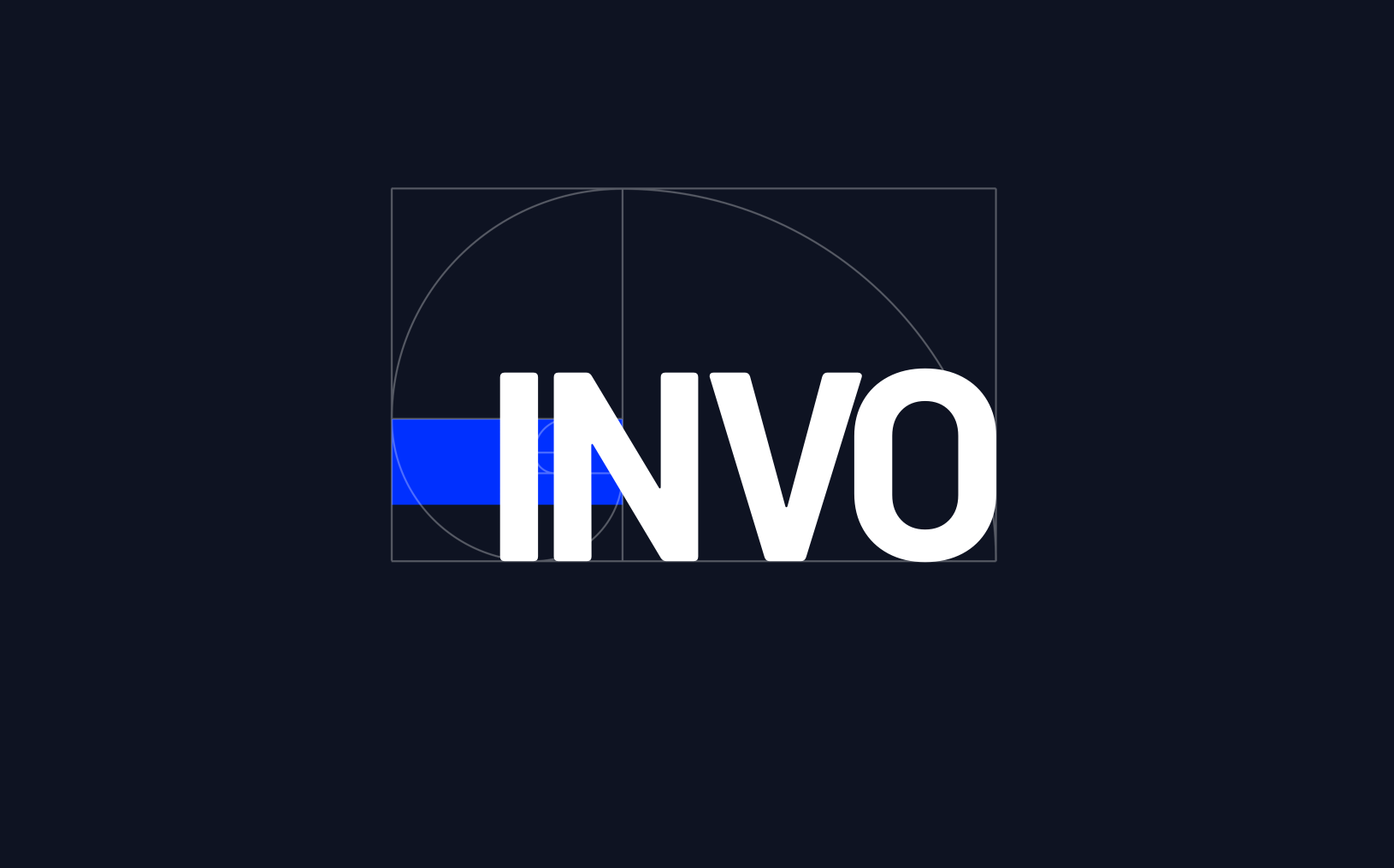
As you can see, the spiral indicates where to place elements in the design. The blue rectangle lines up with the rectangle from the spiral and the letters are placed to suit the golden spiral as well. Although the design is not entirely based on the golden ratio, it was used to create some elements of it. All this makes for the logo to present as visually pleasing.
Besides branding, the golden ratio is also used in typography, image cropping for the website and many other things. All in an effort to make websites as beautiful as possible for the viewers and that is precisely why using the golden ratio in web design should be important to web designers.