Even though you might have the best products in the universe, the best customer service, the fastest shipping – it all might go to waste without great design. Both UI (User Interface) design and UX (User Experience) design matter when it comes to increasing your conversion rates or at least not making them lower. Despite being at the top of Google search results page but without proper graphics and design, potential customers will just click off your eCommerce shop in no time! Learn how bad graphic design can impact your eCommerce conversion rates and use those tips to make your business even better through design!
First impressions matter
Despite the saying “you shouldn’t judge a book by its cover”, people almost always do. You have about half a second to grab their attention when they click on your website. That’s not much. How to make the most out of it with great design?
Many people clutter their main page with a lot of information and messy design – lots of different products, blog posts, graphics, images and contact info. And most people despise this kind of a mess. Design your main page to be as simple as possible. Don’t use lengthy descriptions, use simple color accents or call to actions to grab attention. Also, use visual queues like arrows or buttons but don’t overdo them! Make it easy for a potential customer to identify what it is that you’re selling. Working with a great designer is key to make your eCommerce shop a work of art.
Remember that the first impression really matters. Try to convey the general sense of what you’re offering through the main page design. So for example if you’re selling mostly tables and a few chairs – don’t show off the chairs with your main page design, because that is not your focus product. Your goal should be to grab the attention which will lead to a purchase. Designing your website so that it shows off your products the best it can is really crucial.
Navigation is key
Navigation design is extremely important if you want people to buy what you’re selling. Design it so that it’s easy for them to find what they desire! The most important thing is to not assume that you know better than your customers. Often times, the eCommerce owners feel like they know everything and that leads to low conversion. Trust your customers and trust your designer (provided you’ve chosen the right one).
Conducting UX design research or doing an UX design audit will help with designing the perfect navigation for your specific website. By asking your target audience how they would categorize your products, you will get a clear image of how you should approach designing the navigation on your website. As a result your conversion rates will not suffer from bad graphic design!
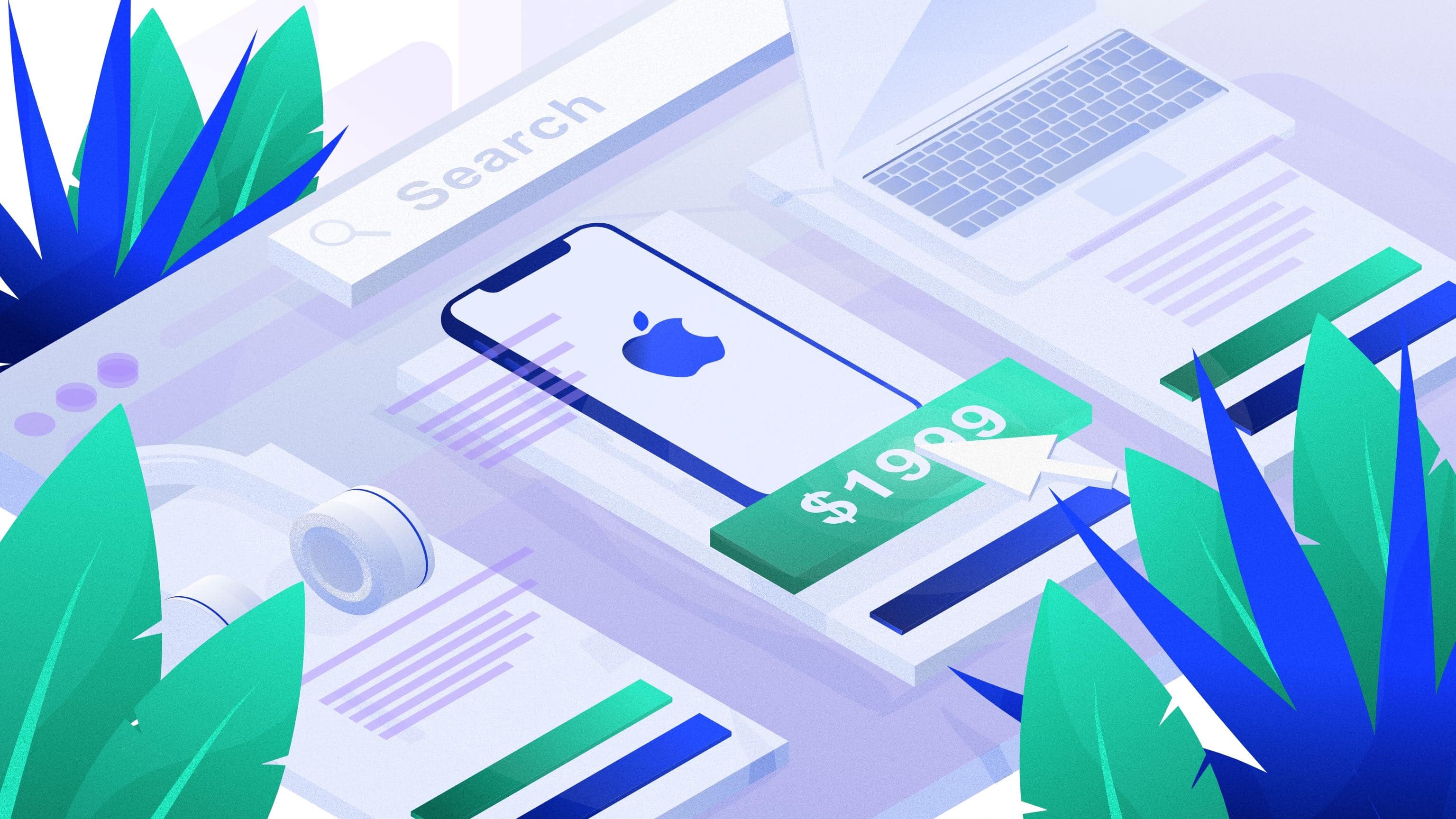
Searching for the perfect product
Many users use a search bar instead of the navigation menu, because it’s simply quicker when it comes to finding a desired product. That’s why you should make sure that the search bar is visible at all times and easily accessible. It’s not strictly design-related but if the names of your products are not specific, do not contain the name of the actual product or are grammatically incorrect, it will cause problems for potential customers when looking for something specific. Although, it’s not so much a design matter, try to name the products so that the name actually represents and describes what the product is. It’s better to name the product “Red Adidas Sneakers” instead of “Adidas Shoes”, because when someone is looking for sneakers specifically and they use the search bar, the desired, searched for item won’t show up.
Categories
Some people use the search bar, but others prefer to use the menu and categories. That’s why it’s so important to design easy navigation for your website. Here’s where the categories come in – they should be designed mindfully of how your target audience would actually categorize your products (again, conducting UX research is extremely helpful here). Categories done badly will just cause confusion and result in lower conversion rates.
Remember not to clutter your design with too many categories and always give them straightforward names. Also, on category pages, you should’t use confusing graphics or images marketing different products, because the customer may get lost and, in effect, not make a purchase. Use limited text and keep the design as simple as you can to make your customer’s experience as smooth as possible!

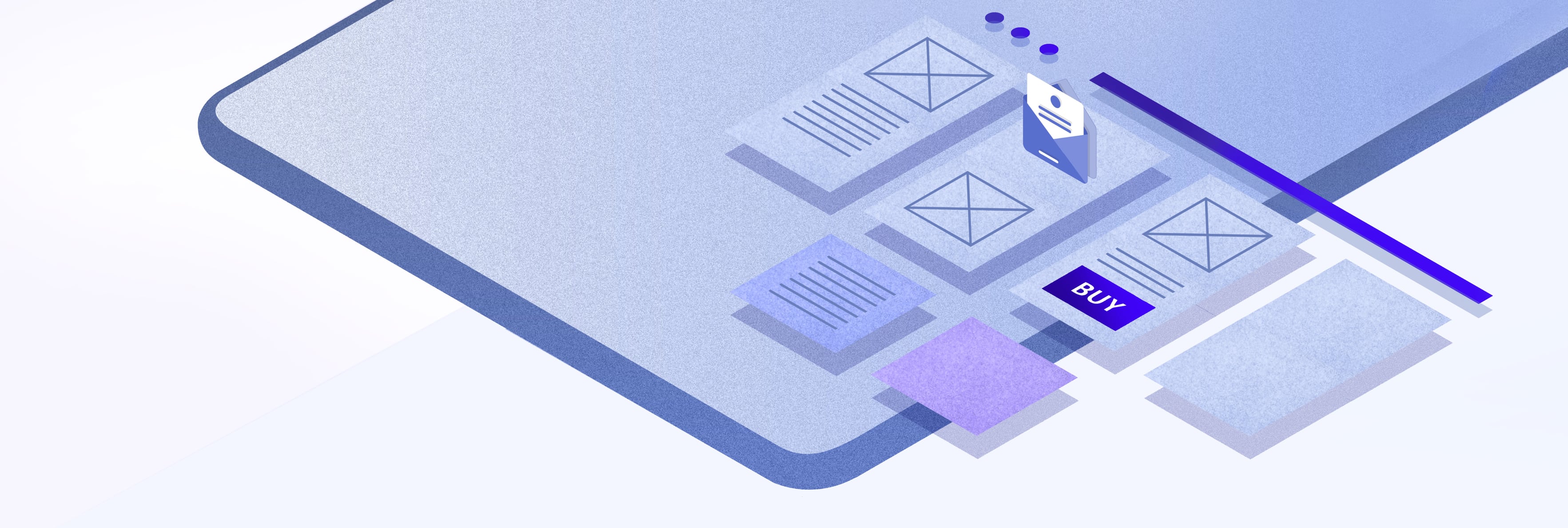
Clear call to actions for a quick purchase
Again, simplicity in design is key. You don’t want the customer to lose focus and get lost on your website because of graphic design done badly. Call to actions are extremely important when it comes to improving your conversion rates. And again, bad graphic design of those could really hurt your growth.
The most important call to actions like “Add to cart” or “Checkout” should be designed to be more visible and grab attention more than less important ones like “Read Reviews” or “Read More”. Those are just examples, because every website’s design is different but the rule applies everywhere – primary CTA’s should be, for example, designed using bold font, while secondary CTA’s should be designed using regular font. Despite it being a simple design change to make, it can truly make a great difference!
Product pages, images and descriptions
Okay, so your customer has easily found what they desire to buy, but it’s not the finish line yet. Bad graphic design can still get in their way of making a purchase. The product page is where the customer should get all the information about the desired product in detail. It’s also great if your design includes information about availability or shipping time included, because those can impact the decision process. Remember about the typography and fonts design as well. It’s important that they’re easy to read and pleasant to the eye. The product page should be designed to be simple as well, with clear CTA’s.
A very important thing is to provide high quality images and graphics of your products, preferably on a white background (although that depends on a product). This builds credibility in the eyes of your customers. If you use low quality graphics or stock images you will not gain trust and decrease the chance of someone making a purchase. When it comes to descriptions, the design should be simple but also informative, so that the customer has all the information they need to make a purchase.
Another thing is not to over-clutter the design of product pages (as well as the whole mobile and web design). Every good designer will tell you that a smart use of white space can make a huge difference! Using white or other neutral colors will grab attention exactly where you want to and help you emphasize specific things through your design.

Tailored to your target audience
Here’s where the design plays a crucial role – in your branding. It can really make or break a deal. There’s even a thing called the Halo Effect – it’s when it’s easier to sell another product under a well established brand. You can read more about it in our post about the branding process. But your branding is extremely important when it comes to your eCommerce website’s design. Defining your target audience and designing your branding for them is the way to go. Trust us, your customers will be grateful for a cohesive visual identification, brand identity and a great logo design.
To help you understand this more, here’s a simple example: a website selling perfume for women should be designed in a more feminine way and use delicate colors like pastel pinks and yellows, while a website selling razors for men would be designed more “harshly” and use colors like black, blues or grays. Although it’s an extremely general example, and it not always works this way in every industry, it can help you understand why it’s important to tailor your branding and designs to your customers. Make sure that your design is cohesive so that your customers can easily recognize your brand. It will help you build trust and, as a result, increase your conversion rates.
Personalized experience is a memorable one
People want to feel special. Make their experience feel designed especially for them and they will remember it and be grateful for it! Personalization is a really important aspect of your eCommerce shop’s design. Designing sections like “you might also like” or “customers who bought this product also viewed” is a simple thing, but it helps to make your customer’s experience feel more special and build trust and brand awareness. Also, personalized newsletters designed for your customers or recommendations based on past purchases are a simple but effective way of making your customers feel noticed and cared for, again, through design.
If you design the experience with your website to be memorable, you have a higher chance of people coming back to you and showing their gratitude by recommending the shop to others. It’s a great way to increase your conversion and it doesn’t have to be expensive – you can introduce the changes gradually. Many eCommerce CMS’s such as WordPress or Shopify provide many options for personalization and improving your design for free!
Quick checkout equals a happy customer
People don’t want their online shopping to take long. They also don’t want to take time putting in information. That’s why if you see that many people click off your website during the checkout process you should definitely look closely and check if there aren’t any design problems. A quick and simple checkout is what people want and expect, so your design should provide that. The checkout is the final destination of your customer’s journey so it would be a shame to lose their interest here due to graphic design done badly.
Here’s what you can do to simplify the checkout process (not only design-wise): make sure your store remembers your logged-in user’s data – it’s no one’s desire to type in the same things over and over again. Also, regarding actual design, remove any distractions from the checkout page (any graphics, ads or additional text). This will make the whole process feel simpler and quicker.
When it comes to logging in or creating an account, people prefer to use an existing account (such as Google, Facebook, Twitter), so, if it’s possible, enable registration and logging in using existing accounts. What is also important is how easy it is for the customer to switch between the checkout and the shopping page. Make sure your design makes it easy and smooth to decrease the risk of abandoned carts.
Remember about different platforms and devices
It’s important that your design is great across all different devices and platforms – not just desktops. If your website looks bad on mobile phones – it’s likely the reason for your low conversion rates. Make sure that your shop is running smoothly on every device, especially mobile ones. Around 70% of all Google searches are done from mobile devices and people usually do their shopping using phones. That’s why it’s super important to make the mobile design as great as the desktop one.
If you have the budget for it, you can also build a simple designated mobile app for your shop. It’s increasing in popularity to do so, and the customers usually appreciate a dedicated app (but, as always, remember to check with your target audience). Nowadays, most of graphic designers remember about all the different platforms but you should be mindful of that as well.
Show that you care by showing off customers service
A huge mistake a lot of online shops make is not paying enough attention to the customer service portion of the website. This is another area where bad graphic design can make or break a deal. Make sure that you FAQ’s and Help sections (whatever they’re called) are simple and easy to navigate, designed beautifully and contain useful information. Having a greatly designed customer service page increases credibility in the eyes of your users and is extremely helpful when it comes to making a purchasing decision.
You need to know that your users go through various decision-making stages before they buy anything. And it’s important to be there with them and for them at all of those stages, including when they have certain doubts and questions – your design should address that. Neglecting to help them makes you seem like you don’t really care and is extremely off-putting for potential customers. Also, not much of a design matter, but it’s great to update your customer service page whenever a new question or doubt occurs. If a customer emails you with a question that’s not in the FAQ – consider adding it, because other people may have the same problem or query.
Trust and credibility – make your customers feel secure
When shopping online people often fear frauds and it’s important that your design makes them feel safe. Some websites don’t have their contact information stated clearly or it’s hidden somewhere through the website. That’s a grave mistake. People need to see that they’re giving their personal information to a trustworthy and credible shop. Poor graphic design can make it seem like you are not deserving of the user’s trust.
Make sure that your contact info is designed in a simple way and that it contains all the necessary data. It would be great if you provided multiple ways of contacting you such as a email form, phone number and email address. Designing it that way will make the user feel like they are cared for and that there is someone they can go to should they stumble upon a problem. It’s also worth to note that when buying more expensive products people will desire to see the contact info even more.
Your design should also provide easy access to your shop’s policies such as privacy policy, terms and conditions and other useful resources. It will make the customers feel secure and help build credibility as well. It’s important that such files are easy to access because it will help avoid possible confusion on the user end.
Reviews
Reviews are often really important for customers when making a decision. They provide additional information about the product and have a great impact on your users. That’s why it’s important to design and display them in a way that’s easy to access and digest.
You may even take it up a notch with your design and make your reviews more useful by adding additional, relevant information about the reviewer (such as gender, age, location – depending on your specific website and target audience) or highlighting the most important parts of each review. You can also provide reviews’ summaries or descriptions to make it easier for your customers to find the desired information.
Design has a huge impact on your conversion rates – make sure it’s taken care off!
Areas of your website mentioned above are really important when it comes to increasing your conversion rates through design. Whether you’re just starting designing your online shop or want to improve your existing design, you should look closely at all those elements. Graphic design elements are something that can make or break a deal, because they’re what we notice first. Working closely with a great designer will help you grow your business and grab attention from your target audience. Be creative and let the design work sell your products!
Doing UX design research or audits will help you understand your audience and, therefore, make your website perfectly designed for them. The key to increasing conversion is being mindful of what your users desire and what are their fears and doubts. That’s why, when designing your eCommerce shop, you should think about hiring a professional design and software development agency or an excellent graphic designer (remember to check out their portfolio) – they will provide the expertise and design skills needed to make everything run smoothly.
Want to learn more? Here are our recommended reads on graphic design tips for ecommerce
If you want to learn more about how a designer works, how to design the perfect web page for eCommerce or how the designing process looks, try reading the following articles and guides to better understand how design can impact your conversion rates:
1. EVERYTHING YOU NEED TO KNOW ABOUT DESIGNING FOR ECOMMERCE
2. THE ULTIMATE GUIDE TO DESIGNING ECOMMERCE WEBSITES
3. 20 COMMON UX MISTAKES IN ECOMMERCE WEBSITES
4. WEBSITE REDESIGN FREQUENCY: HOW OFTEN SHOULD YOU REDESIGN YOUR WEBSITE?
5. TWO TYPES OF USER MOTIVATION: DESIGN TO SATISFY
6. UX DESIGN FOR E-COMMERCE: PRINCIPLES AND STRATEGIES
7. THE ULTIMATE GUIDE TO ECOMMERCE WEBSITE DESIGN
8.
9. WHAT IS A BRAND BOOK?
If you are looking for someone to help you with the design of your website or spot any bad design signs on your page, don’t hesitate to contact us!