In our free time, we like to engage in creating some concept projects to get to know other markets and their user environments. This time, we took on the sneakers world which has grown significantly during the last few years. We decided to design Sneak – an eCommerce app which would bring the users a simple, smooth experience in the process of getting their hands on all the freshest drops.
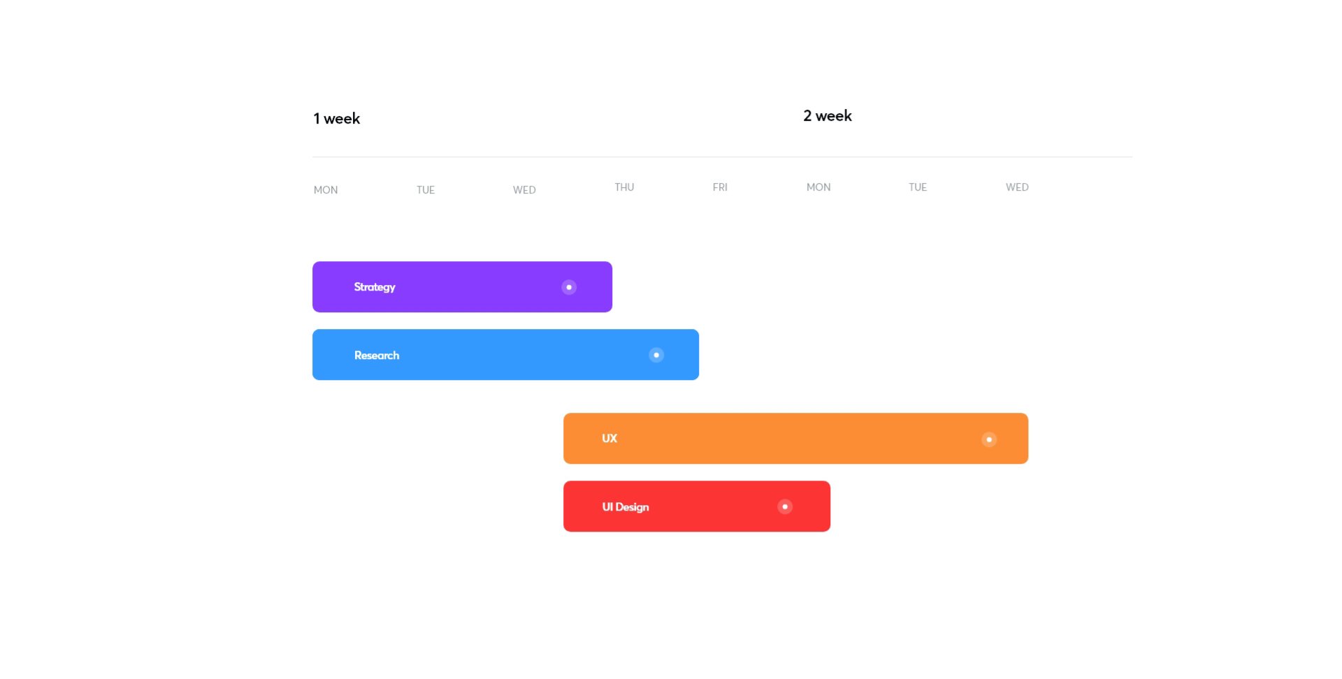
Project Timeline
As a concept project, it took us less time to complete this design, but here’s a breakdown of this project’s stages.
Prioritizing eCommerce Features
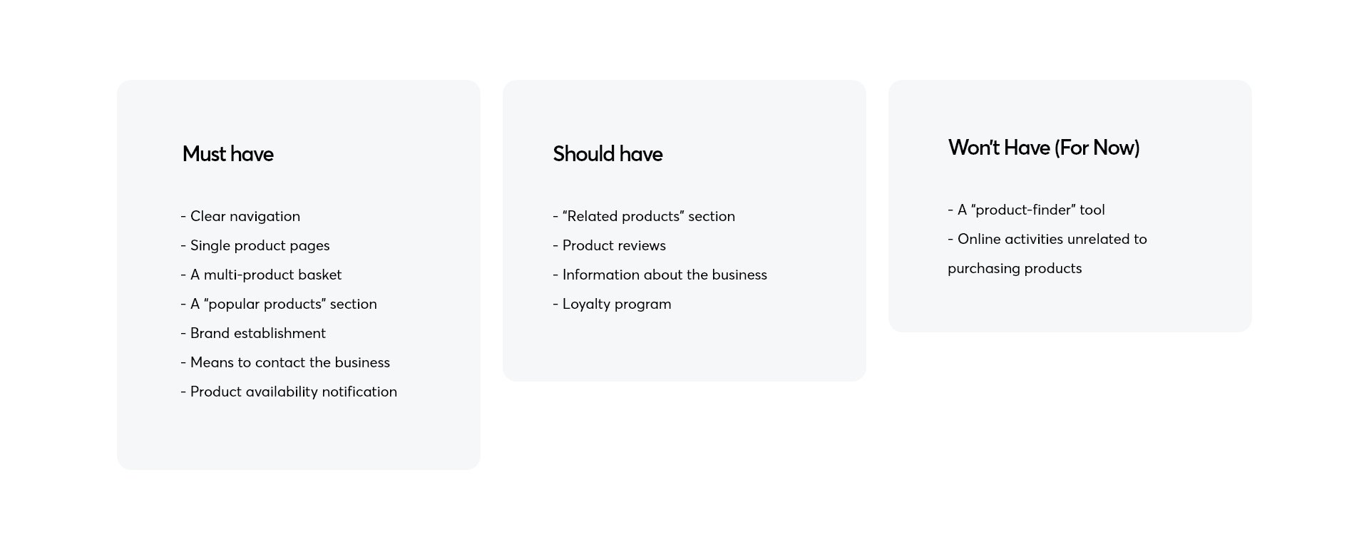
As a result of our research, we were able to categorize features into three groups: “must have”, “should have” and “won’t have (for now)”. This is an important step in every project, especially when a client has a tight deadline. “Must have” features are the ones that the app can’t be successful without. As you can see below, this list includes necessities like navigation, product pages and other features that make the app useful. The next list are “should have” features. These are not a deal-breaker if they’re not included, however, they make the user’s experience much better and can impact revenue significantly. The last list are “won’t have (for now)” features. The features on this list are not needed but are a nice touch. It is important to include such a list, because after the first launch of the app, they can be added to enhance the app’s performance.
User Expectations
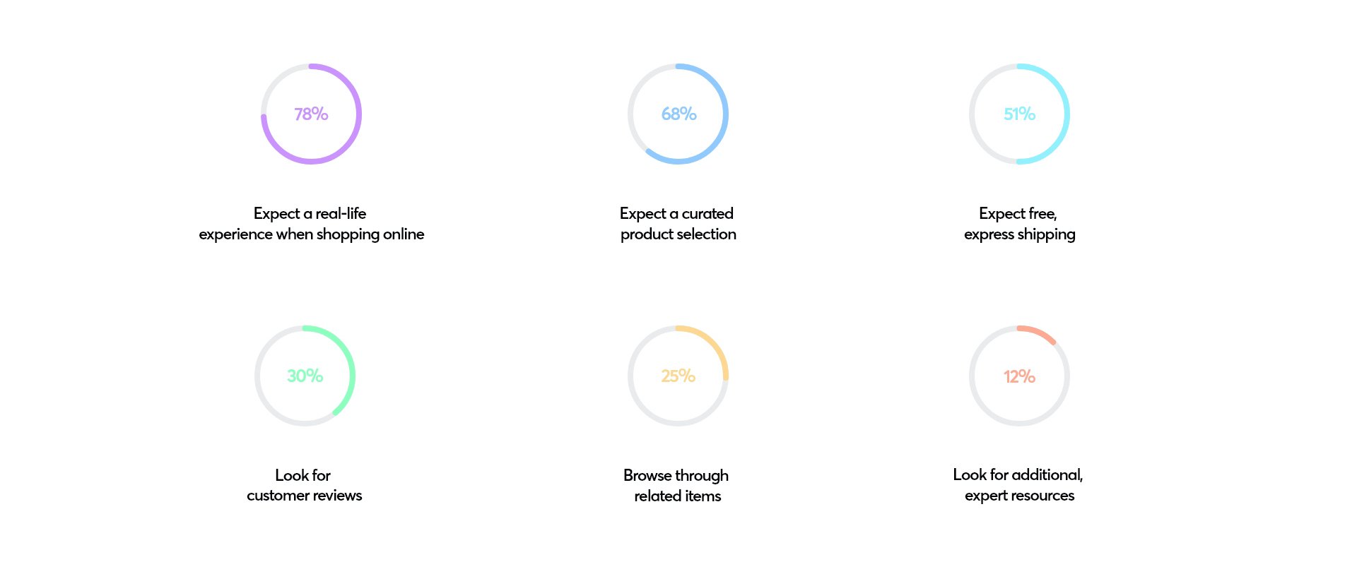
In the process of prioritizing features we utilize our research. In this case, we focused on quantitative data about what users expect when sneaker-shopping. Here’s the results:
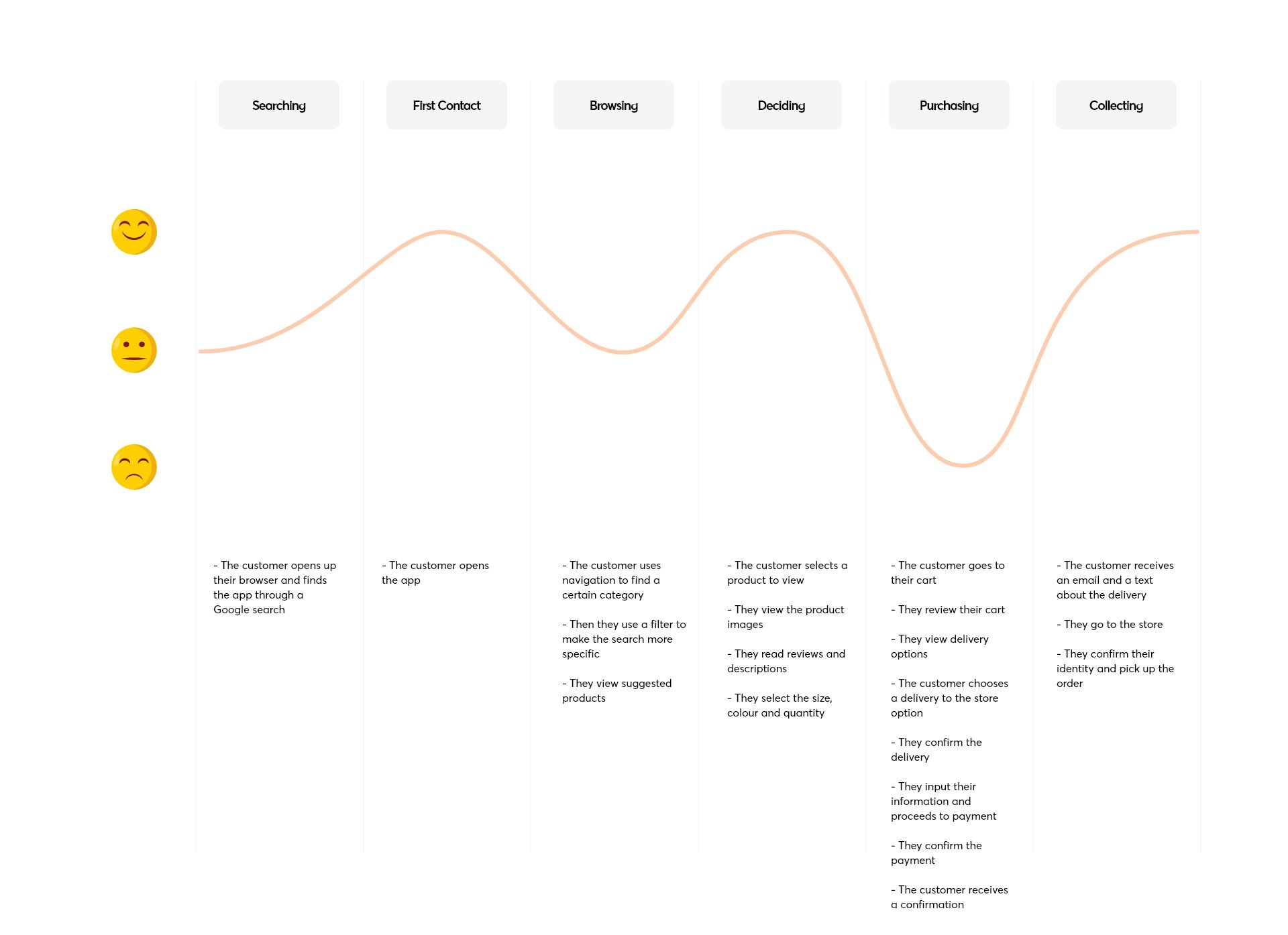
Customer Journey
When using every product, doesn’t matter whether it’s a web app or a mobile eCommerce app, the user performs several different actions which impact their satisfaction level. It is important to break down their journey through your product into small steps and find spots where their satisfaction is low. This way, when designing, you can counteract those pain points and make your user feel better through design.
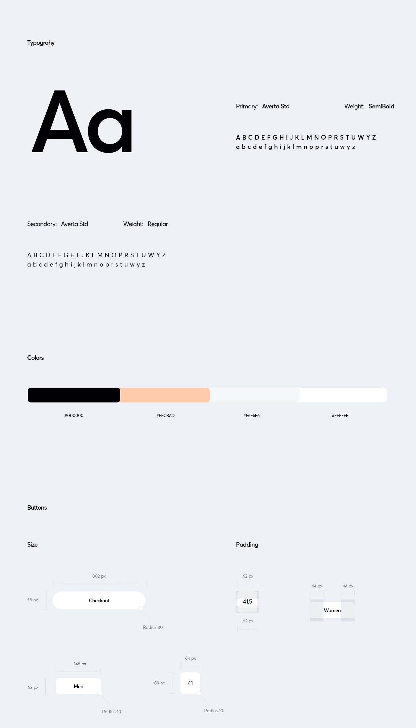
Style Guide
A style guide is much more than just a collection of fonts and colors. It helps significantly when several people work on a project to keep everything standardized, neat and clean. With each of our projects, we create a style guide that’s as detailed as possible, to also be of help for our clients later on with future projects, marketing campaigns or rebrandings.
Wireframes
Before we begin on designing the UI, we create wireframes to test them on a few target users. To conduct the tests we usually use interactive prototypes in InVision. In order to get the best results, we use low fidelity prototypes. This way, test subjects are not distracted by colors or styling and can focus directly on performing certain tasks and evaluating functionalities.
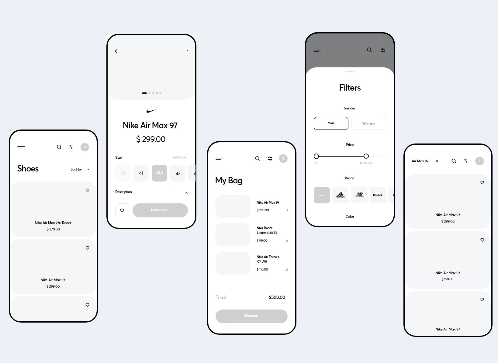
The Final Product
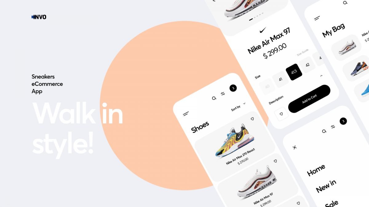
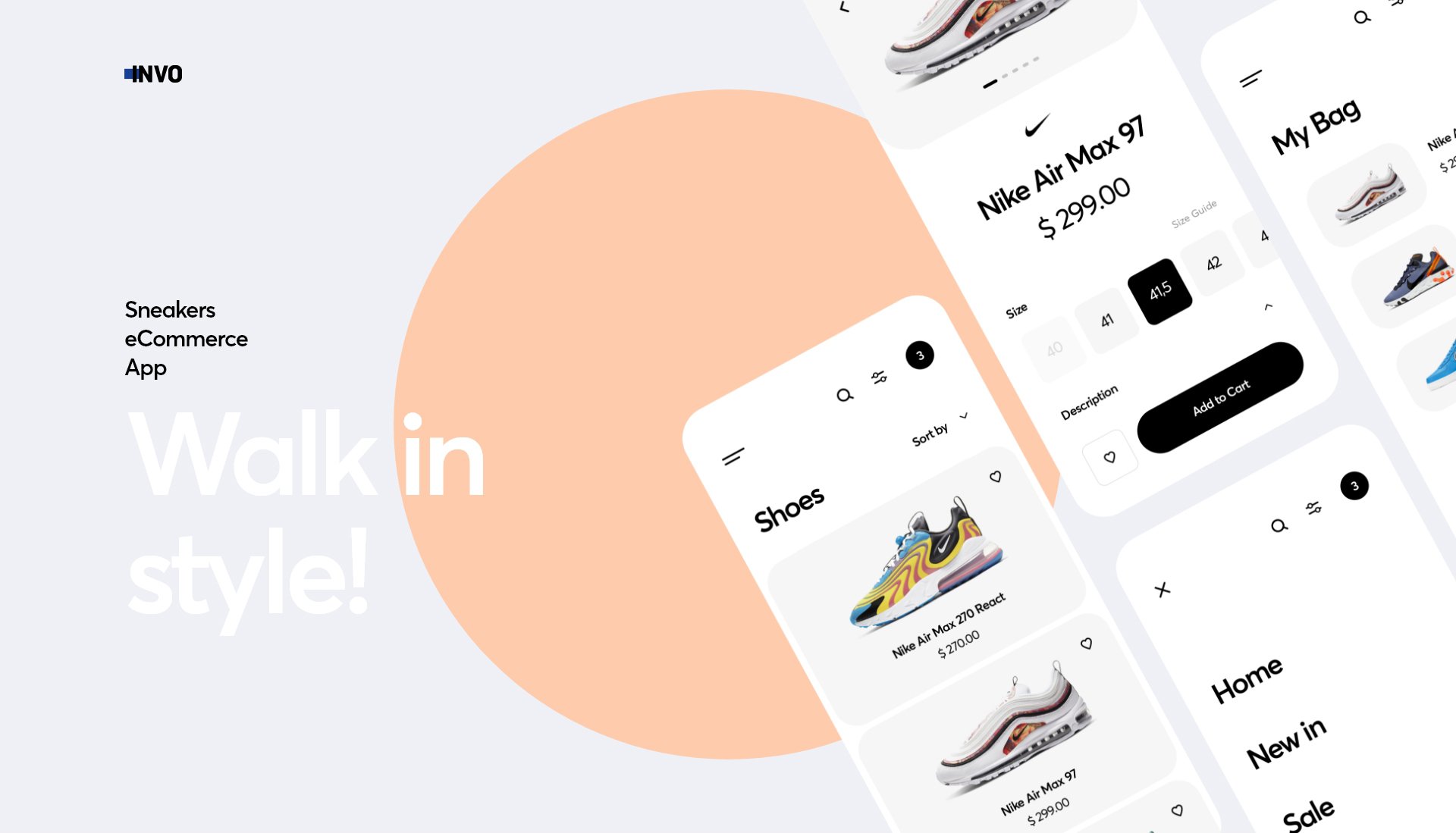
After we go through research, wireframing, testing and designing the UI, we have the final product ready for the last round of tests. And here’s the complete product and it’s main functionality highlights.
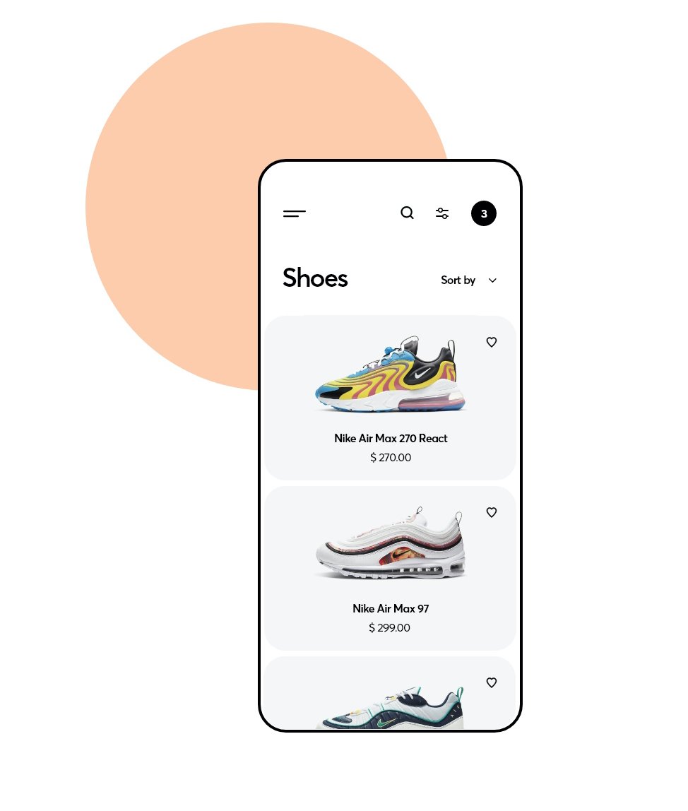 Minimalistic Design
The whole app was meant to provide a seamless experience, so we decided to go with a minimalistic approach that would both make it easier for the users to navigate and better showcase the beautiful products.
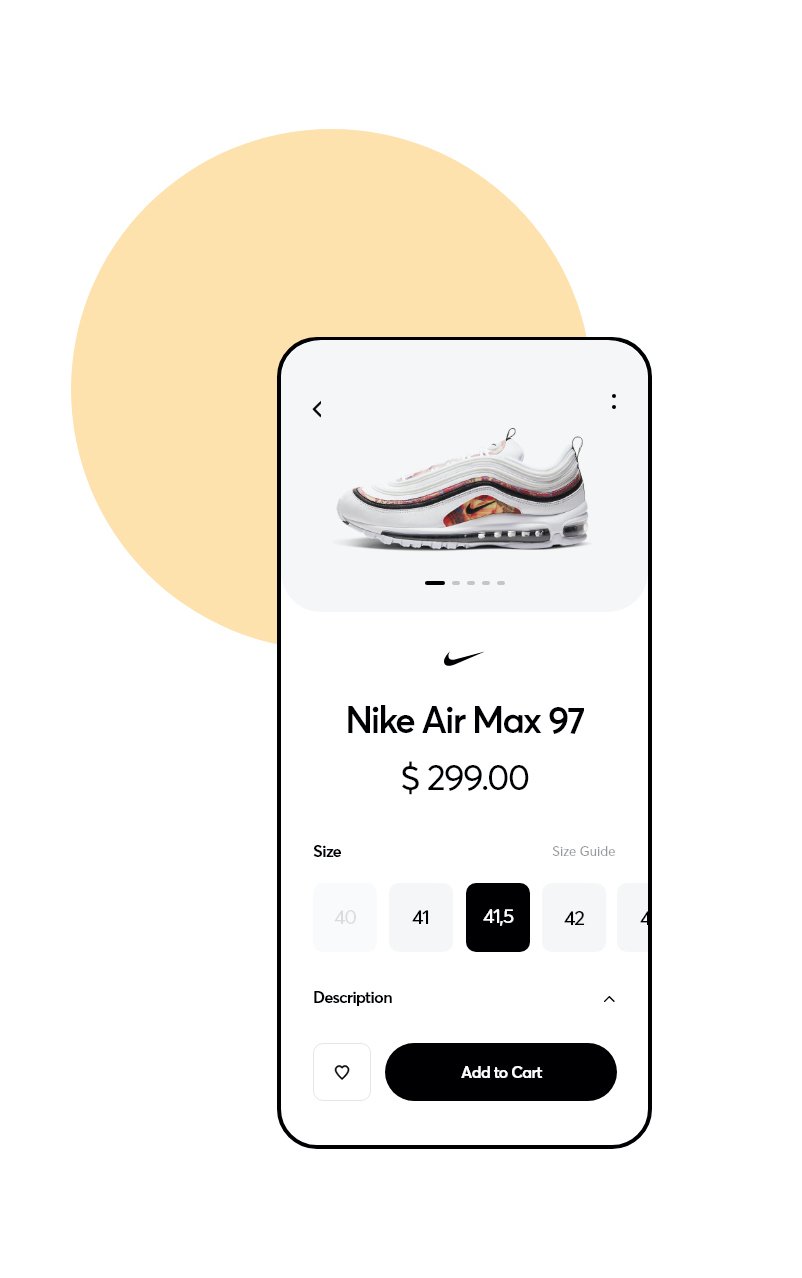
Easy Access
The product page we designed provides for easy access to all the user needs to make a purchasing decision – from images and price through sizing to a description. Especially when it comes to limited products, time is of the essence and can’t be wasted on cluttered apps.

Quick Checkout
To decrease the level of stress users experience when shopping for the latest shoes, we focused on making the cart and checkout pages extremely simple with just the necessary information.
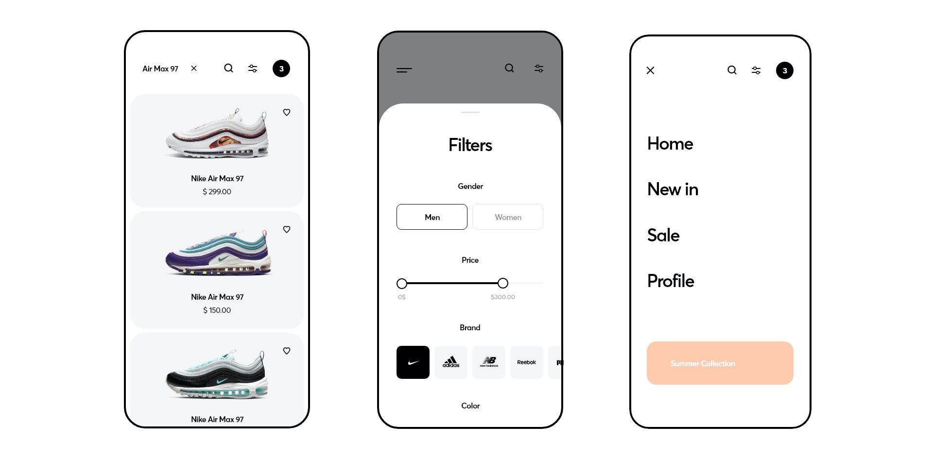
Simple Search
Users need to be able to quickly find what they are looking for, otherwise, they simply click off. That’s why, we made the search and filters easy to access from anywhere in the store.
If you are interested in learning more about this project, you can visit our Behance profile for a case study or our Dribbble to see single shots and app screens. Our team is also available for other projects, you can contact us at [email protected].