In the rapidly evolving field of web design and user experience, analyzing A/B tests like the recent one from Booking.com can provide valuable lessons. They modified their homepage to better highlight their deals pages, but the results weren’t quite what they expected. However, the process and outcomes offer useful insights.
Headline Adjustment: The Impact of Words
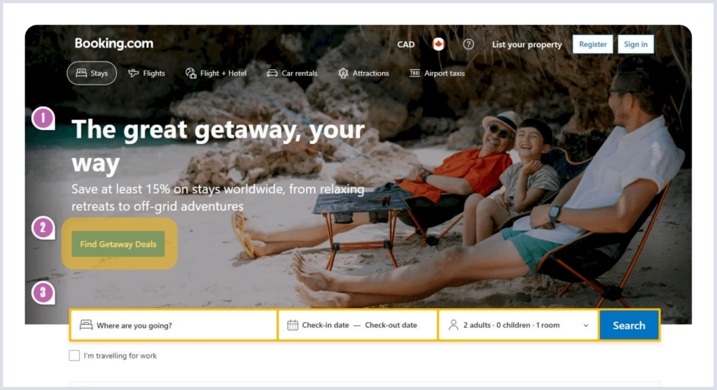
One of the biggest changes was the new headline: “The great getaway, your way.” They wanted to make the site feel more personal, but the way the words were arranged ended up being a bit confusing. This shows how every little detail, even how you break the lines, can affect how users see your site.

Introducing a New Button: Streamlining User Paths
The introduction of a “Find Getaway Deals” button was a significant shift, making it easier for users to access specific offers directly. This kind of update demonstrates how a well-thought-out addition can lead users smoothly towards their goals, enhancing overall site usability. The visible impact on other sections of the site also highlights how interconnected design elements are.

Adjusting the Search Bar: Finding the Right Balance
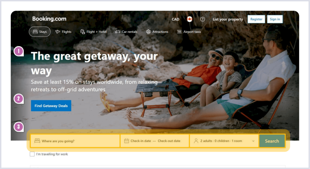
The new button’s addition resulted in the primary search bar being pushed lower, potentially diminishing its visibility. This change serves as an important lesson in the balance required in web design—promoting new features without overshadowing essential ones. Every design decision should consider its effect on user experience across the site.

Takeaways for Other Platforms:
- Keep Testing: Booking.com’s experiment shows why it’s good to keep trying new things. Other websites can also learn from this by continuously testing different designs and features to see what works best.
- Guide Your Users: Where you place buttons and how you design your page layout really matters. It can greatly affect how users interact with your site. Always aim to make their experience straightforward and helpful.
- Focus on Details: Even small changes can have big impacts. Pay close attention to every element of your site to ensure everything works well together.
- Balance Your Features: While it’s great to highlight new offers, you also need to keep the essential features accessible. Always think about what your users need most to make sure they have a good experience.
Conclusion
The story of Booking.com‘s A/B test offers a rich source of lessons in design strategy and user interaction. By continuing to explore and apply these insights, we can enhance our own platforms, ensuring they not only meet but exceed user expectations.
