
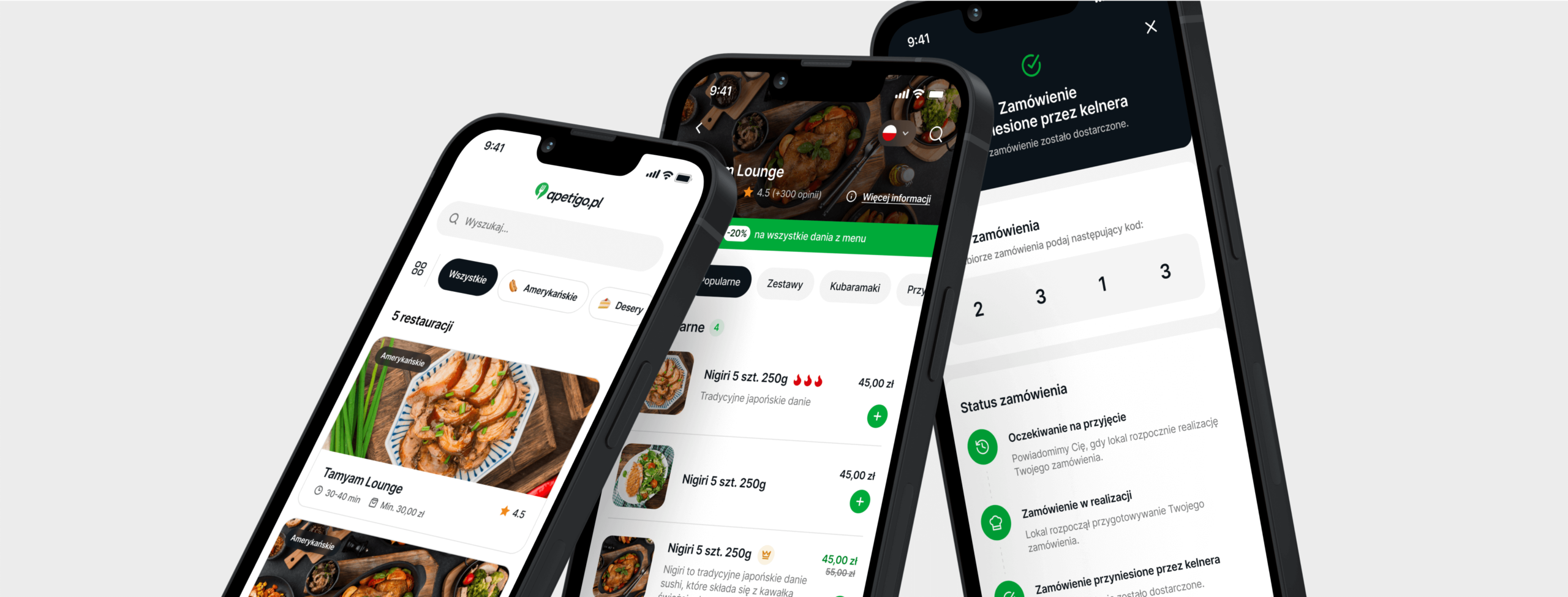
Revolutionizing the Restaurant Industry with Apetigo
Apetigo, a foodtech app, aimed to revolutionize the restaurant industry by digitizing the ordering process with QR codes, digital menus, and a CRM system managing all transactions. However, they faced a significant challenge: low adoption rates. Users preferred traditional menus over the digital solution, finding the app difficult to use and not user-friendly. Apetigo approached us to analyze the user journey and redesign the app from the ground up, with the goal of making the ordering process faster and more enjoyable than using traditional menus.
Client’s business objectives
Enhance User Experience
Our primary goal was to make the Apetigo app more intuitive by streamlining the user journey and addressing any usability issues.Increase Adoption Rates
We aimed to to make app-based ordering quicker and more straightforward than traditional methods, improving the UX to encourage more users to switch.Speed Up the Development
By adopting a modular design, we aimed to expedite future updates, allowing for easier and faster enhancements.
Boost Customer Satisfaction
We aimed to surpass traditional menus in convenience and speed, enhancing overall user satisfaction and encouraging long-term use.Identifying Challenges
The primary challenge was the low adoption rate of the app due to its perceived complexity and unfriendly user interface. The ordering process was not as fast or enjoyable as using traditional menus, leading to a preference for the latter. Our objective was to upgrade the user experience (UX) of the app, making it a more attractive alternative to conventional menus.

Our Strategy: User-Centric Approach to Redesigning the App
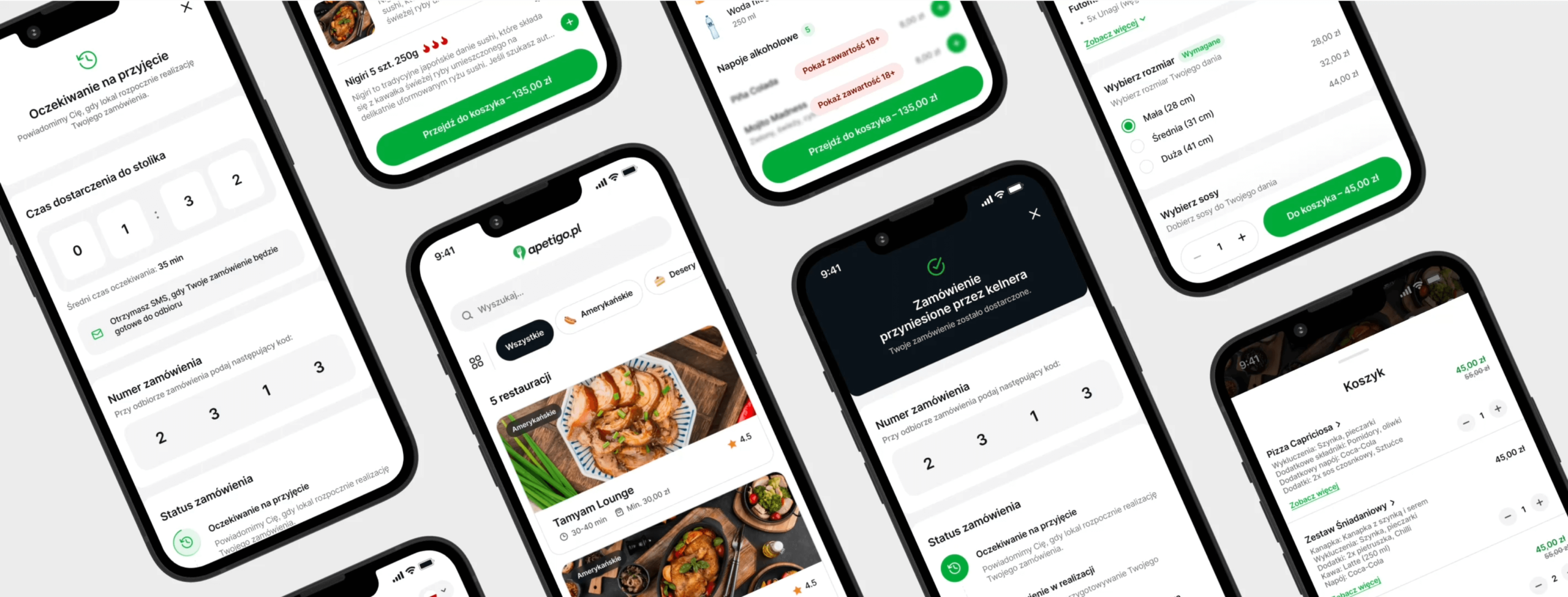
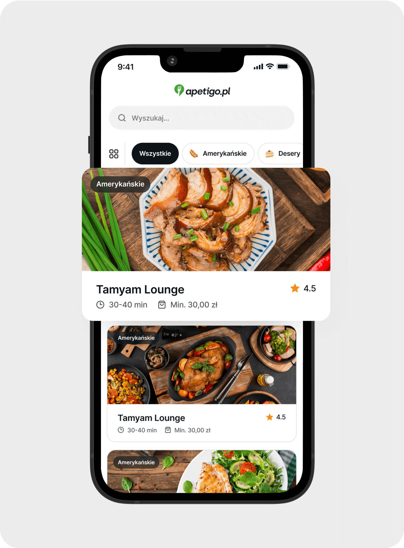
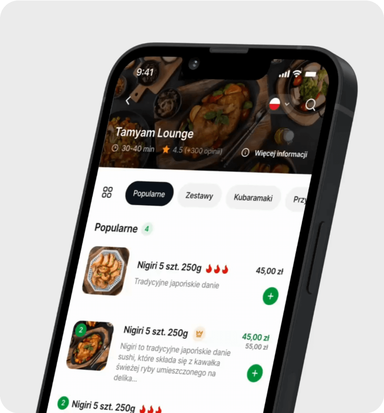
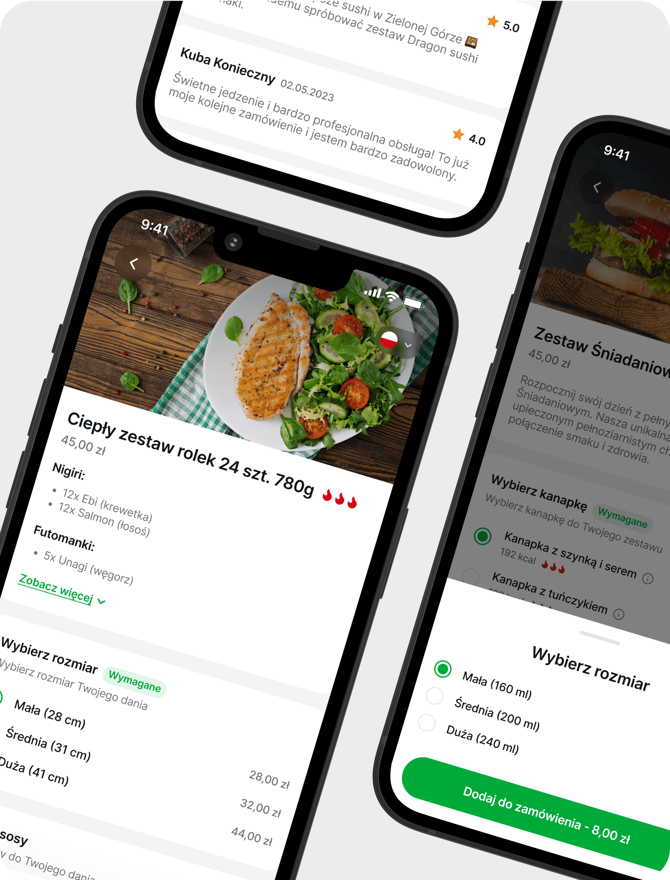
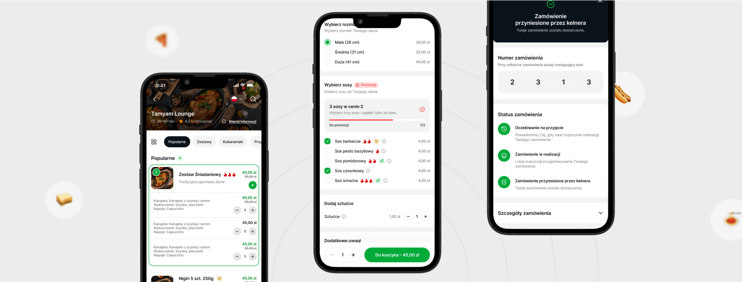
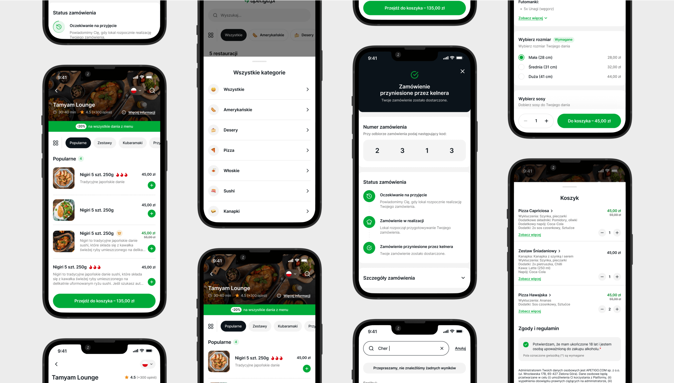
Our approach began with a thorough analysis of the user journey to understand the motivations and pain points of the users. This was followed by a UX review of the existing app, during which we identified numerous UX mistakes. We created a report outlining these issues for the client. Armed with this information, we moved on to the UX design phase, creating hundreds of screens with a focus on modular design. This approach would speed up the development process in the future thanks to ready-made components and states. After the design was ready, we created design documentation for the development team.
Transforming User Experience and Streamlining the Ordering Process
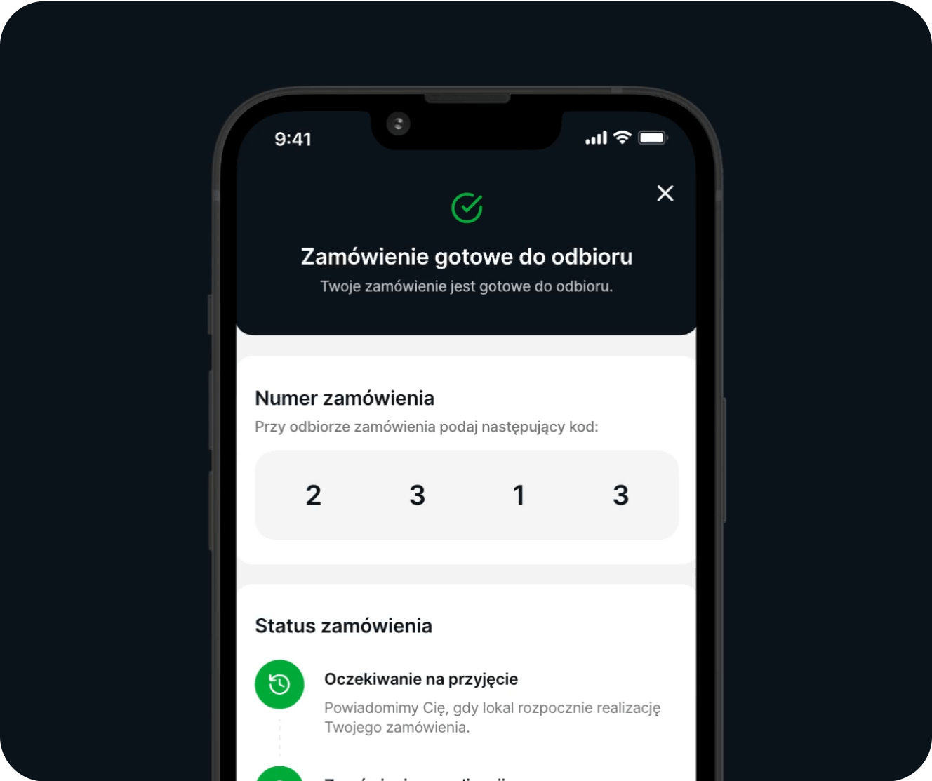
We overcame the challenges by focusing on the user experience. We identified the pain points in the user journey and addressed them in our redesign. We simplified the ordering process, making it faster and more enjoyable. We also improved the payment process, making it quicker and more efficient. Our modular design approach allowed for future development speed and flexibility.

Results: Doubling the Speed and Boosting Adoption Rates
The redesigned app was a success. The ordering process, thanks to filters and categories, was twice as fast as using a traditional menu. The user-friendly design and improved payment process led to an increase in the adoption rate of the app.
Conclusion: Delivering a Successful Redesign and Meeting Objectives
Our collaboration with Apetigo resulted in a successful redesign of their app, addressing the initial challenges and meeting the set objectives. The project showcased our ability to understand user needs, identify UX issues, and create effective solutions.
Long-Term Impact: Setting a New Standard for Digital Menus in the Restaurant Industry
The redesigned UX flow of the app is expected to increase the adoption of the tool, making it a better alternative for conventional menus. The faster and more enjoyable ordering process will likely lead to higher customer satisfaction and increased usage in the long term. This project has set a new standard for digital menu systems, showcasing the potential of digitization in the restaurant industry.
We build excellent products.
Let’s build one for you.


